
What is a statistic? A statistic is a number or amount compared to an earlier number or amount of the same thing. Statistics refer to the quantity of work done or the value of it in money.
A down statistic means that the current number is less than it was.
An up statistic means the current number is more than it was.
We operate on statistics. These show whether or not a staff member or group is working or not working as the work produces the statistic. If he doesn’t work effectively, the statistic inevitably goes down. If he works effectively, the statistic goes up.
Negative Statistics
Some things go up in statistic when they are bad (like car accidents). However, we are not using negative statistics. We only use things that mean good when they go up or mean bad when they go down.
Statistic Graphs
A graph is a line or diagram showing how one quantity depends on, compares with or changes another. It is any pictorial device used to display numerical relationships.
A graph is not informative if its vertical scale results in graph line changes that are too small. It is not possible to draw the graph at all if the line changes are too large.
If the ups and downs are not plainly visible on a graph, then those interpreting the graph make errors. What is shown as a flat-looking line really should be a mountain range.
By scale is meant the number of anything per vertical inch of graph.
The way to do a scale is as follows:
Scale is different for every statistic.
1. Determine the lowest amount one expects a particular statistic to go—this is not always zero.
2. Determine the highest amount one can believe the statistic will go in the next three months.
3. Subtract (1) from (2).
4. Proportion the vertical divisions as per (3).
Your scale will then be quite real and show up its rises and falls.
Scaling Graphs | |
An incorrectly scaled graph does not show changes in a statistic accurately, thus making the graph less useful.
|
A correctly scaled graph clearly shows changes in a statistic, making it easier to determine which condition to apply.
|
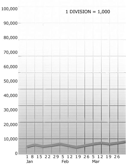
Here is an incorrect example.
We take an organization that runs at $5,000 per week. We proportion the vertical marks of the graph paper of which there are 100 so each one represents $1,000. This when graphed will show a low line, quite flat, no matter what the organization income is doing and so draws no attention from executives when it rises and dives.
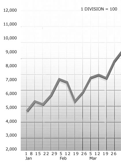
This is the correct way to do it for Gross Income for an organization averaging $5,000/week.
1. Looking over the old graphs of the past 6 months we find it never went under $2,400. So we take $2,000 as the lowest point of the graph paper.
2. We estimate this organization should get up to $12,000 on occasion in the next 3 months, so we take this as the top of the graph paper.
3. We subtract $2,000 from $12,000 and we have $10,000.
4. We take the 100 blocks of vertical and make each one $100, starting with $2,000 as the lowest mark.
Now we plot Gross Income as $100 per graph division.
This will look right, show falls and rises very clearly and so will be of use to executives in interpretation.
Try to use easily computed units like 5, 10, 25, 50, 100, and show the scale itself on the graph (1 div = 25).
The element of hope can enter too strongly into a graph. One need not figure a scale for more than one graph at a time. If you go onto a new piece of graph paper, figure the scale all out again and, as the organization rises in activity, sheet by sheet the scale can be accommodated. For example it took 18 months to get one organization’s statistics up by a factor of 5 (5 times the income, etc.) and that’s several pieces of graph paper, so don’t let scale do more than represent current expectancy.
On horizontal time scale, try not to exceed 3 months as one can get that scale too condensed too, and also too spread out where it again looks like a flat line and misinforms.
Correct scaling is the essence of good graphing.